Studio Noel
Accessible colour palette checker
Overview
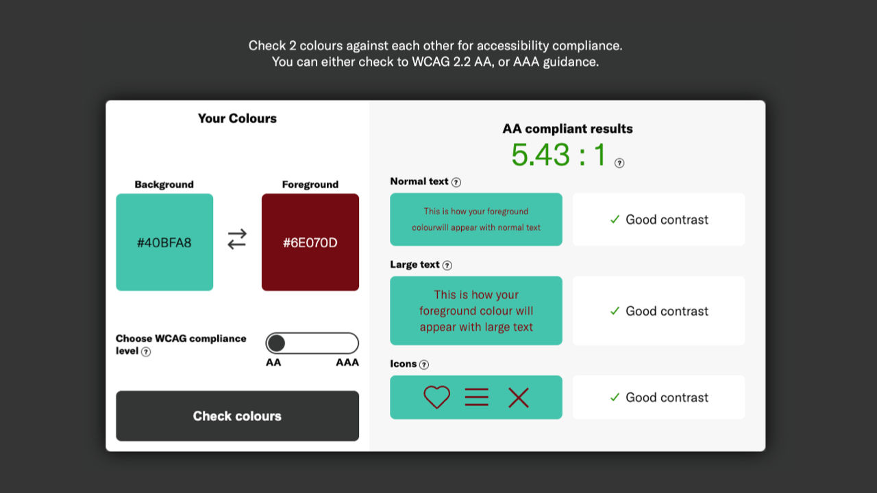
I collaborated closely with Studio Noel to provide technical expertise and create an online tool that they and their clients can use to improve the accessibility of a brand’s colour palette. The final solution is a Vue.js application embedded into an existing Wordpress website using Netlify serverless functions to generate downloadable PDF versions of any palette in real time.
Users can create and make subtle changes to any colour palette and see the accessibility ratings adjust in real-time. This app passively teaches basic colour theory while users are experimenting, and gives the full control over the hue, saturation and lightness. All colour combinations can be checked and filtered using WCAG 2.2 AA or AAA standards allowing you to create a design that meets the highest levels of accessibility.
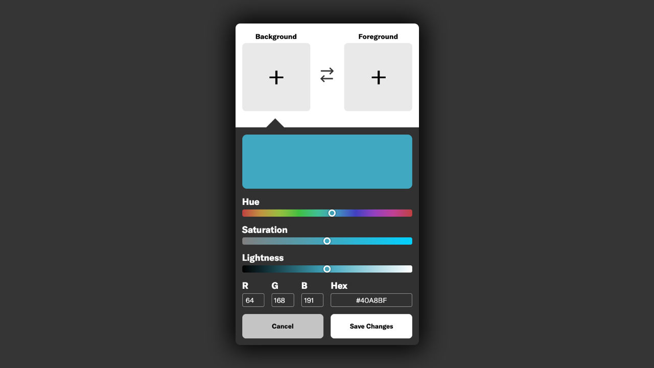
To overcome the problems using the default colour input I created a simple colour picker interface. Safari, Firefox, Chrome etc all have different colour picker interfaces, and again on mobile and tablet. This meant that some users would not be able to make adjustments in a meaningful way as options such as HSL were hidden or unavailable. To lower the barrier to entry and allow anyone to make clear and consistency colour changes, I developed a responsive colour picker interface that consistently gave advanced and novice users the control they need.
Development of the second iteration using machine learning to provide accessible colour recommendations is now underway and coming soon.
You can use the tool here.